 |
Helvetica is a feature-length independent film about typography, graphic design and global visual culture. It looks at the proliferation of one typeface (which celebrated its 50th birthday in 2007) as part of a larger conversation about the way type affects our lives. The film is an exploration of urban spaces in major cities and the type that inhabits them, and a fluid discussion with renowned designers about their work, the creative process, and the choices and aesthetics behind their use of type.
Helvetica encompasses the worlds of design, advertising, psychology, and communication, and invites us to take a second look at the thousands of words we see every day. The film was shot in high-definition on location in the United States, England, the Netherlands, Germany, Switzerland, France and Belgium.
Interviewees in Helvetica include some of the most illustrious and innovative names in the design world, including Erik Spiekermann, Matthew Carter, Massimo Vignelli, Wim Crouwel, Hermann Zapf, Neville Brody, Stefan Sagmeister, Michael Bierut, David Carson, Paula Scher, Jonathan Hoefler, Tobias Frere-Jones, Experimental Jetset, Michael C. Place, Norm, Alfred Hoffmann, Mike Parker, Bruno Steinert, Otmar Hoefer, Leslie Savan, Rick Poynor, and Lars Müller.
Helvetica had its World Premiere at the South by Southwest Film Festival in March 2007. The film subsequently toured film festivals, special events, and art house cinemas worldwide, playing in over 300 cities in 40 countries. It received its television premiere on BBC1 in November 2007, and will be broadcast on PBS as part of the Emmy award-winning series Independent Lens in fall 2008. The film was nominated for a 2008 Independent Spirit Award in the "Truer Than Fiction" category, and was shortlisted for the Design Museum London's "Designs of the Year" Award. An excerpt of the film was included in an exhibition at the Museum of Modern Art in New York.
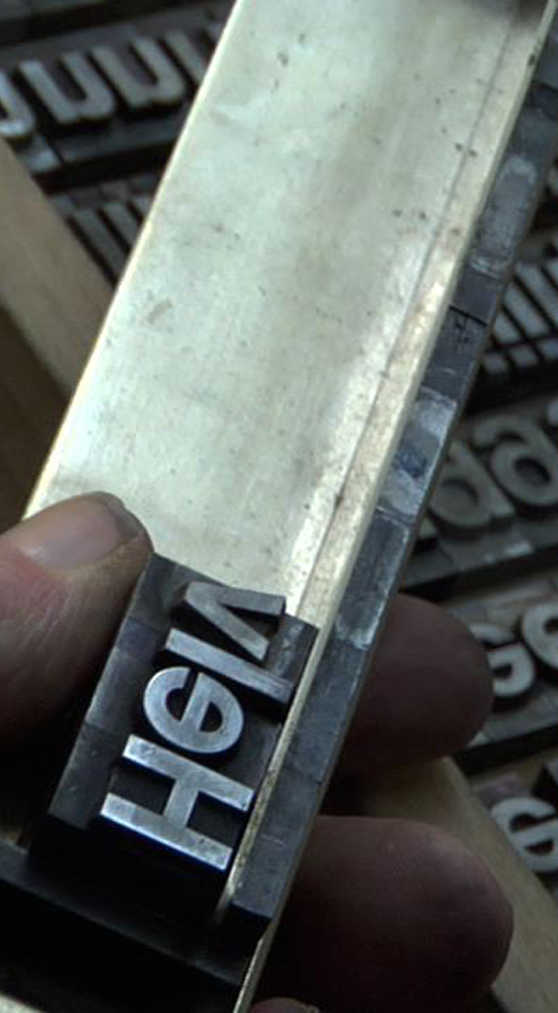
The Helvetica font was developed by Max Miedinger with Edüard Hoffmann in 1957 for the Haas Type Foundry in Münchenstein, Switzerland and quickly became an international hit in the graphic arts world. With its clean, smooth lines, it reflected a modern look that many designers were seeking. At a time when many European countries were recovering from the ravages of war, Helvetica presented a way to express newness and modernity. Once it caught on, the typeface began to be used extensively in signage, in package labeling, in poster art, in advertising—in short, everywhere. Inclusion of the font in home computer systems, such as the Apple Macintosh in 1984, only further cemented its ubiquity.
Fans of Helvetica tout its legibility and its versatility, finding it equally “perfect” for use in a corporate logo or on a local street sign. But not everyone is a fan. Some designers find Helvetica to be dull, predictable and boring. In the 1970s, a backlash occurred when young designers began looking for more energetic, expressive ways to present information. This post-modernist reaction to Helvetica included the “grunge” period of the 1990s, when designers experimented with new concepts in graphic communication, moving away from the orderly, predictable look of Helvetica to a mix of print styles and a wildly varying use of color and line.
Interviewees in HELVETICA include some of the most illustrious and innovative names in the design world, such as Erik Spiekermann, Matthew Carter, Massimo Vignelli, Wim Crouwel, Hermann Zapf, Neville Brody, Michael Bierut, Paula Scher, Tobias Frere-Jones, Bruno Steinert, Leslie Savan, Rick Poynor and Lars Müller. Through the framework of graphic design, HELVETICA explores the tension between the adherence to established principles of design and the desire to express individual thought and taste. The film acknowledges the belief that art is subjective, revealing that print is far more than merely letters forming words.
back to top |